Goals
• Decide the color palette of the application
• Decide the icons of the menus
• Select the images
• Decide the style of the components of the application
• Decide the color palette of the application
• Decide the icons of the menus
• Select the images
• Decide the style of the components of the application
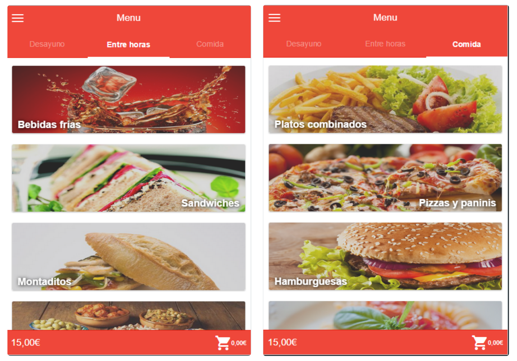
The application needs a color palette that can identify the product and provide an attractive design to the system. The red has been chosen as the dominant color since it transmits energy, dynamism and excitement; properties that should be related to the application.
The system is designed for Android thus the icons should follow the standards for this operating system. The selection of the icons should be made trying to simplify the understanding of the user. That is why the relations between the icon and the related action must be straight forward: the menu uses a burger menu icon, the cart uses a cart icon and so on.
The application is based on images that represent the different kind of products offered. Once a category is selected the actual products are presented and it is crucial that these images are eye catching, informative and simply beautiful. Users should feel as if they were glancing over real food.
Finally, in order to enclose this section one mock-up per screen is represented. These high fidelity prototypes contain the colors, images and icons selected in the previous steps and also the style of every component in the app including menus, buttons, cards, tabs…
.png)
.png)
.png)